
At Elegant Themes, our Video Creators are first and foremost video production professionals who are capable of translating our collective knowledge about WordPress, Divi, and other topics important to our business into engaging videos published across multiple video platforms.
Elegant Themes wouldn't exist without the amazing team behind it. We are a remote team of 106 people from around the world! We take pride in our diversity and modern remote working environment.
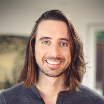
Founder & CEO
Nick made his first website in 7th grade to promote his middle school band. Suffice it to say the band never made it big, but his obsession with the internet is still going strong!
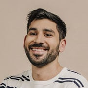
Director of Operations
Mitch is the man that keeps things running smoothly. When he's not finding new ways to make our customers happy, he is probably nerding out on his latest music obsession.
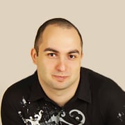
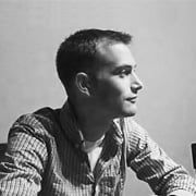
Lead Developer
Elegant Themes Employee #1, Yuriy an incredibly talented developer and the mastermind behind Divi and our other cutting edge products. He loves to play guitar and hates coffee.
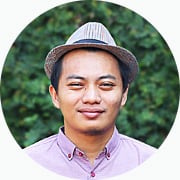
Developer
A recent addition to the team and a new father, Fikri is a talented WordPress developer hailing from Indonesia. He is also the undisputed ET speed typing champion.
Senior Developer
Josh brings a wide breadth of back-end development experience to the Elegant Themes team, and is currently leading the charge on our upcoming theme Extra. It's going to be amazing!.

Content Manager
Nathan manages our content strategy and is charge of creating wonderful Divi and WordPress content every day on our blog and throughout social media..
At Elegant Themes you will enjoy a competitive salary with room for growth, but that's just one part of what makes working at Elegant Themes great.
Don't sweat it! As an Elegant Themes employee, you will have your health and dental needs taken care of through our Kaiser Permanente group health plan.
We believe in working hard, but we also believe in life-work balance. All employees start off with paid vacation, and you get more days each year you work with us.
We love any excuse to celebrate, and holiday season is always a special occasion. Our company dinner at AQ and after-dinner drinks at Bourbon and Branch last year was a blast.
We are invested in your future. We offer all full-time employees the opportunity to take part in our 401k program, including generous company matching.
At Elegant Themes, when the company is doing well, everyone is doing well. Year-end bonuses are a part of the job, and they get even better when we reach our goals!
Even though we're a remote company we still understand the value of meeting in person. That's why each year we come together in a single location to work and play together for a full week. Past locations have included Berlin, San Francisco, and Barcelona.
Copyright © 2025 Elegant Themes ®